Aslan Brewing Co.
In 2012 I was hired to develop the brand identity for Aslan Brewing Co. At that time it was just four guys with big dreams, brewing beer in a little warehouse in downtown Bellingham, Washington. I had been waiting for the opportunity to help build a brand from the ground up and show what I could do with a blank canvas. Aslan gave me just that.
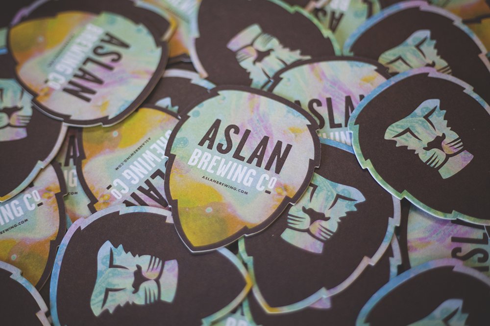
Behind the Logo
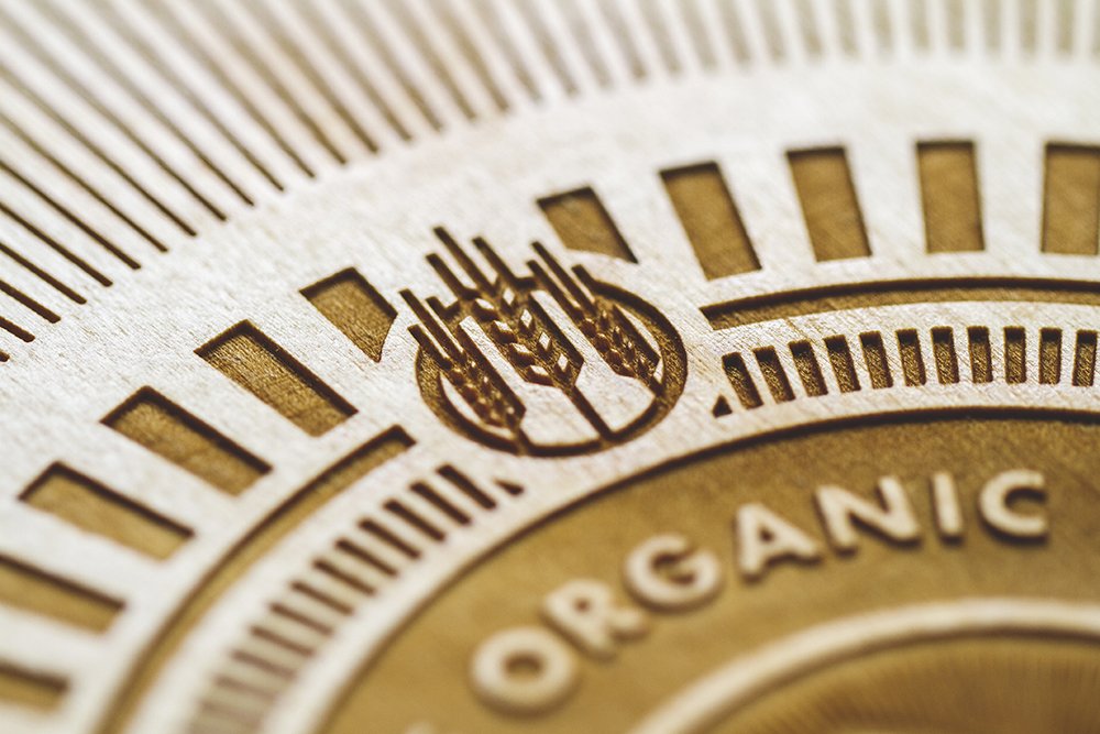
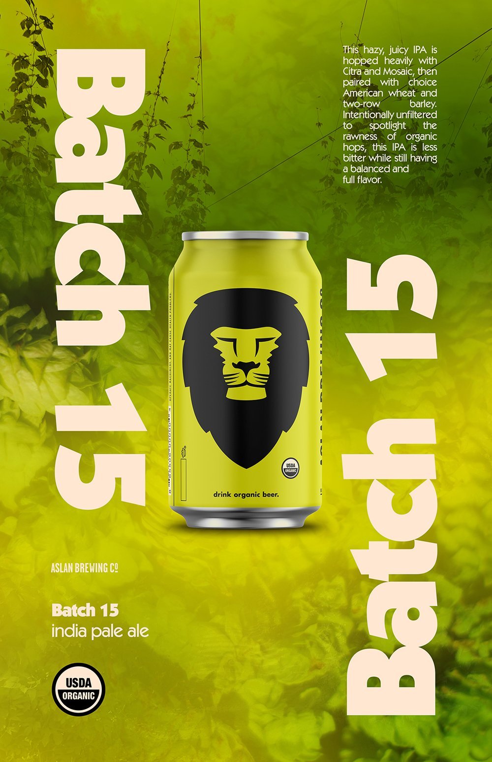
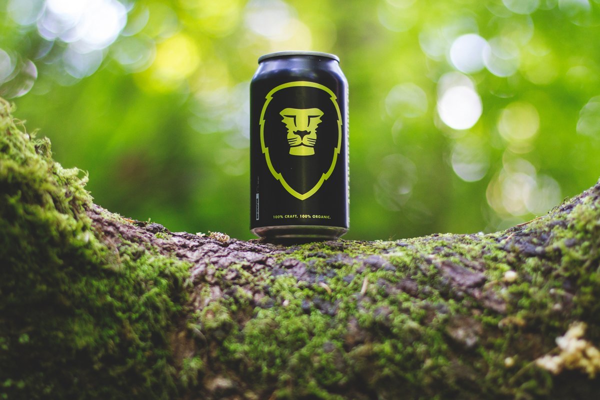
My first project with Aslan was to design their lion icon, which has come to be known as the “hop head”. I was challenged with finding a way to create a unique image featuring a lion that somehow also represented beer. It needed to be iconic, instantly recognizable, and timeless. After days and days of sketching lions, hops, and many other beer related imagery, and many late night chats in the warehouse with Aslan owner Jack Lamb, we made a grand revelation: the silhouette of a hop cone has a striking resemblance to that of a lion’s mane. And at that moment the Aslan hop head was born.
For the typography, I drew inspiration from the past and created a wordmark using a typeface called Garage Gothic - one reminiscent of 40’s and 50’s lead typeset posters and metal stamps. It needed to mesh with the minimal, clean nature of the hop head icon while remaining neutral to allow function in many forms and design scenarios.
While Garage Gothic works fantastic as the headline or title typeface, I wanted a alternative, complimentary typeface for body copy and other text throughout the branding. For this, I went with my personal favorite font: Futura. For me, it’s crisp, geometric form is the the perfect contrast to the condensed, somewhat rugged feeling Garage Gothic. Futura is such an enduring typeface; designed in 1927 by Paul Renner, it’s still found everywhere in modern design. I first fell in love with it as a teen watching the films of Wes Anderson in which he generously features the typeface.
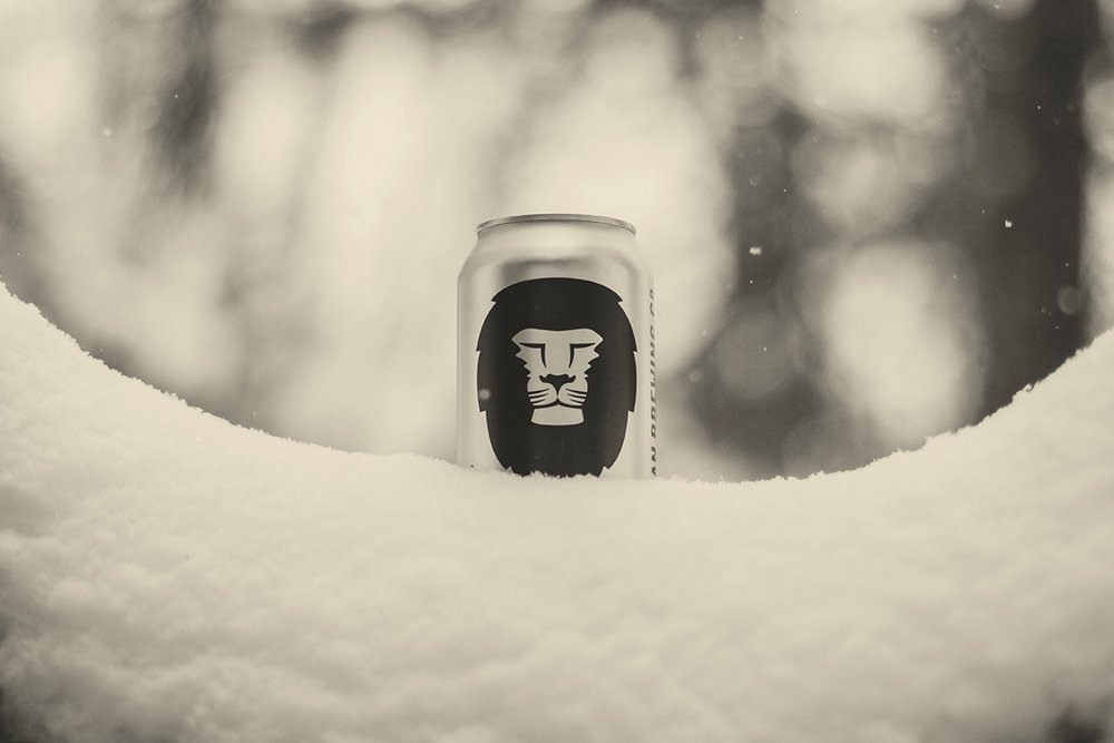
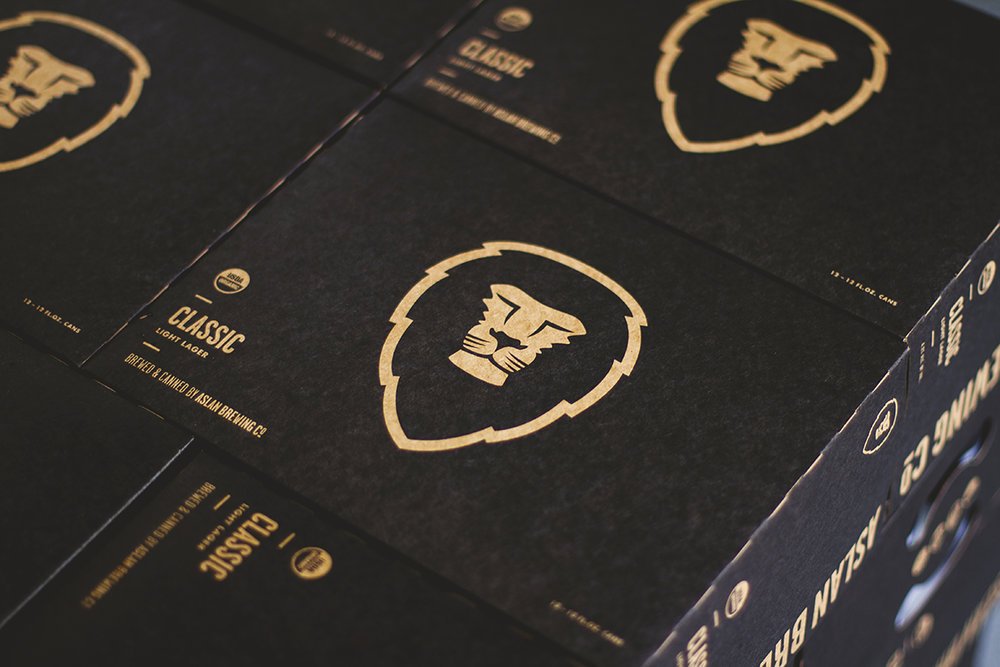


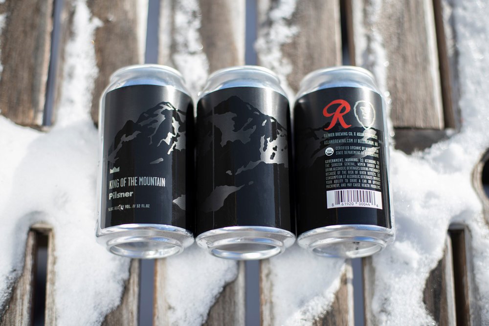
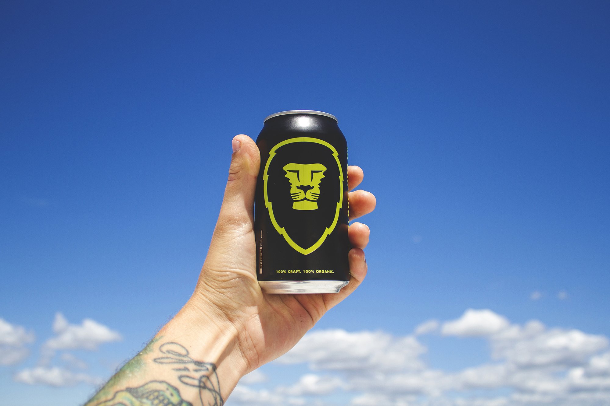
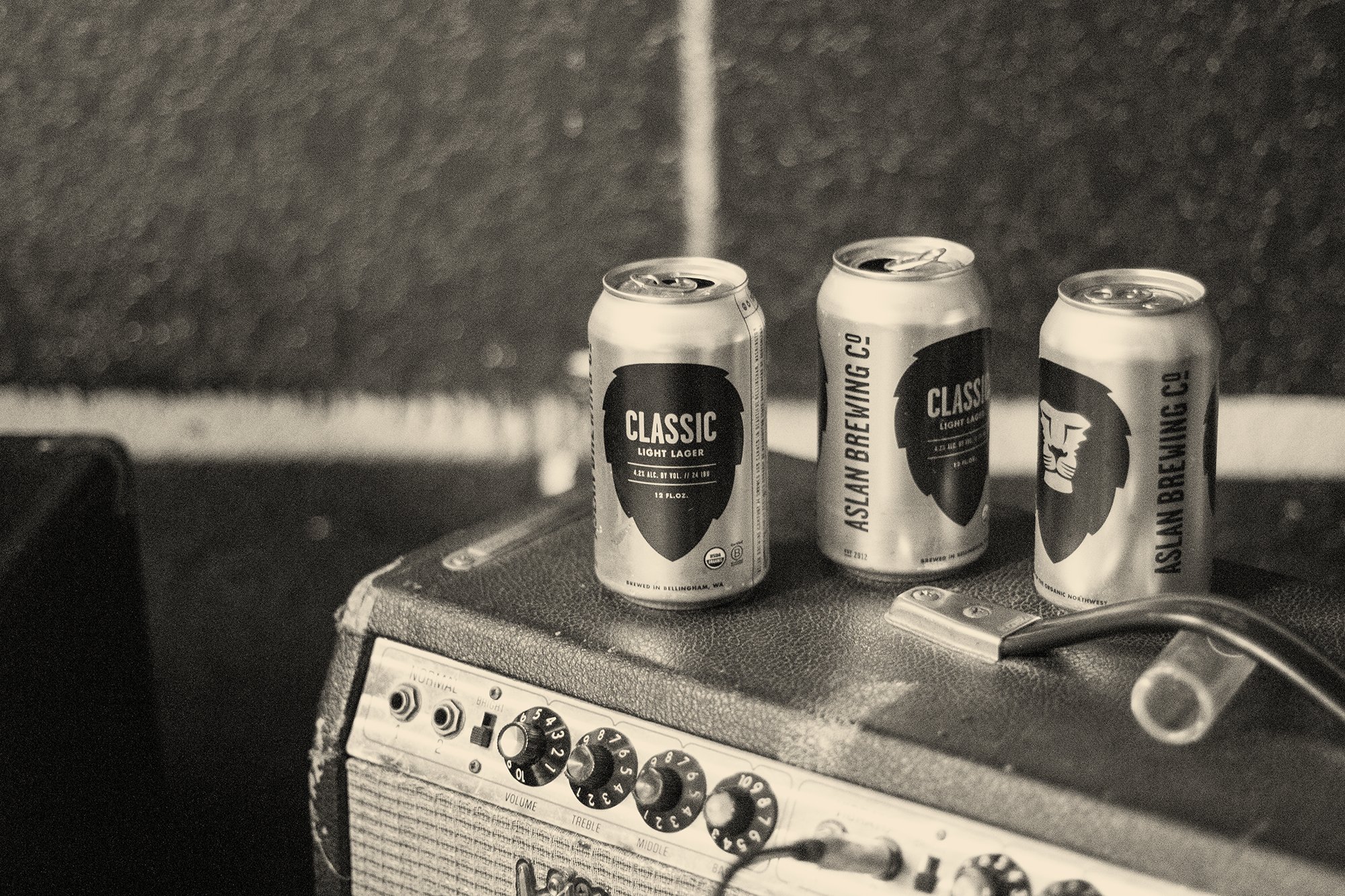
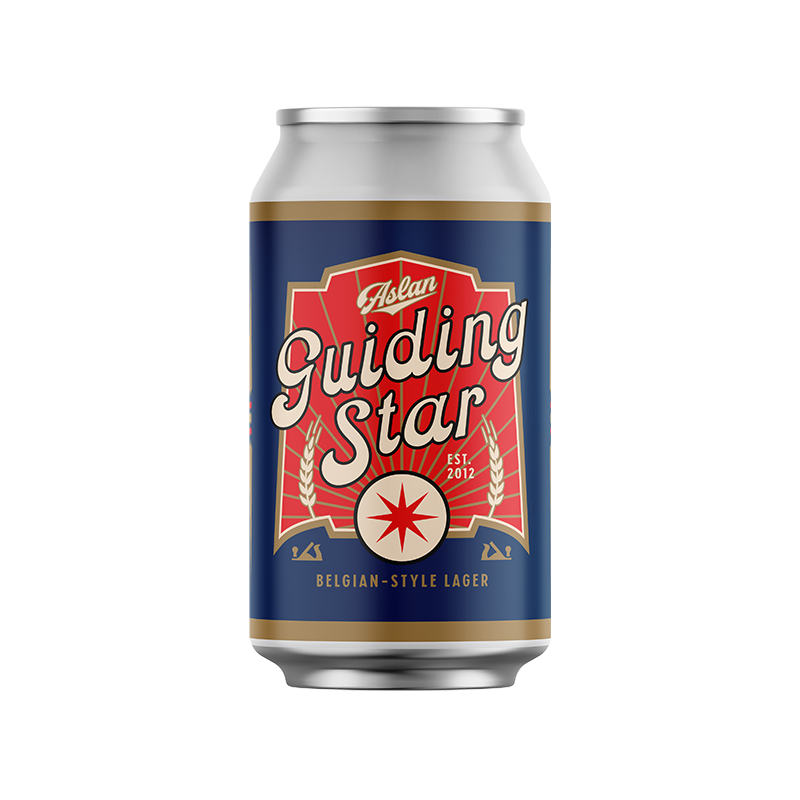
Flagship Can Packaging
As a devout follower of the “less is more” way of life and in design, this was the approach I took for the creation of cans for Aslan’s flagship lineup. I wanted to make their product stand alone on the shelves and go against the grain of what had been a trend of overly designed and busy graphics used across the craft beer industry. With a logo that stands so well on it’s own, it only seemed right to make it the centerpiece of the design.


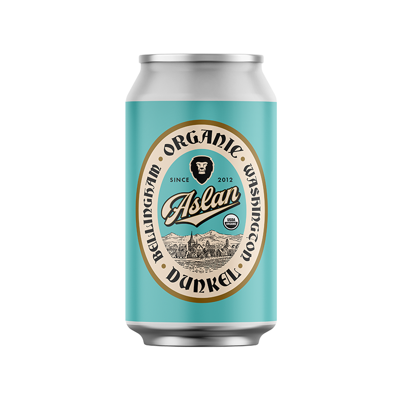
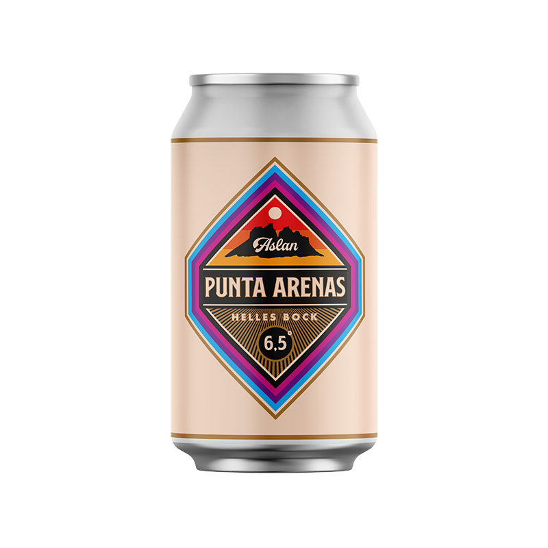
Retro Lager Series
As a passion project of sorts, Aslan’s brewers decided to start a line of seasonal beers inspired by lagers of the past. This has been a long running and super fun project for me. It allows me to step out of my usual design style, research vintage beer labels, and experiment in an attempt to create something that not only borrows, but builds on that aesthetic. Some of my favorite design projects have come as a result of that experimentation.


Here are some of my other favorite Aslan projects from the last decade.